The Multiplicity Pilot is an open-source web platform for collecting, analyzing, and visualizing diversity data in the cultural sector. Developed for Wien Modern, Austria's largest festival for new music, the tool helps cultural institutions make the diversity of their programming visible and redistribute budgets more fairly between privileged and marginalized artists.
Aim of the project
Users can compare planned versus actual programming data across different time periods, supporting evidence-based, privacy-conscious decision-making. As Product Designer, I was responsible for shaping the user journey and translating complex, sensitive diversity data into an accessible, understandable experience. Finding ways to create a user interface that is informative, yet protects sensible data and doesn’t use any harmful language was a rewarding challenge.
The project is being developed in collaboration with Nanographics and D-Arts and will eventually be made available to cultural institutions across Europe. As the platform is still in active development, it is not yet publicly accessible online and can only be viewed on request.
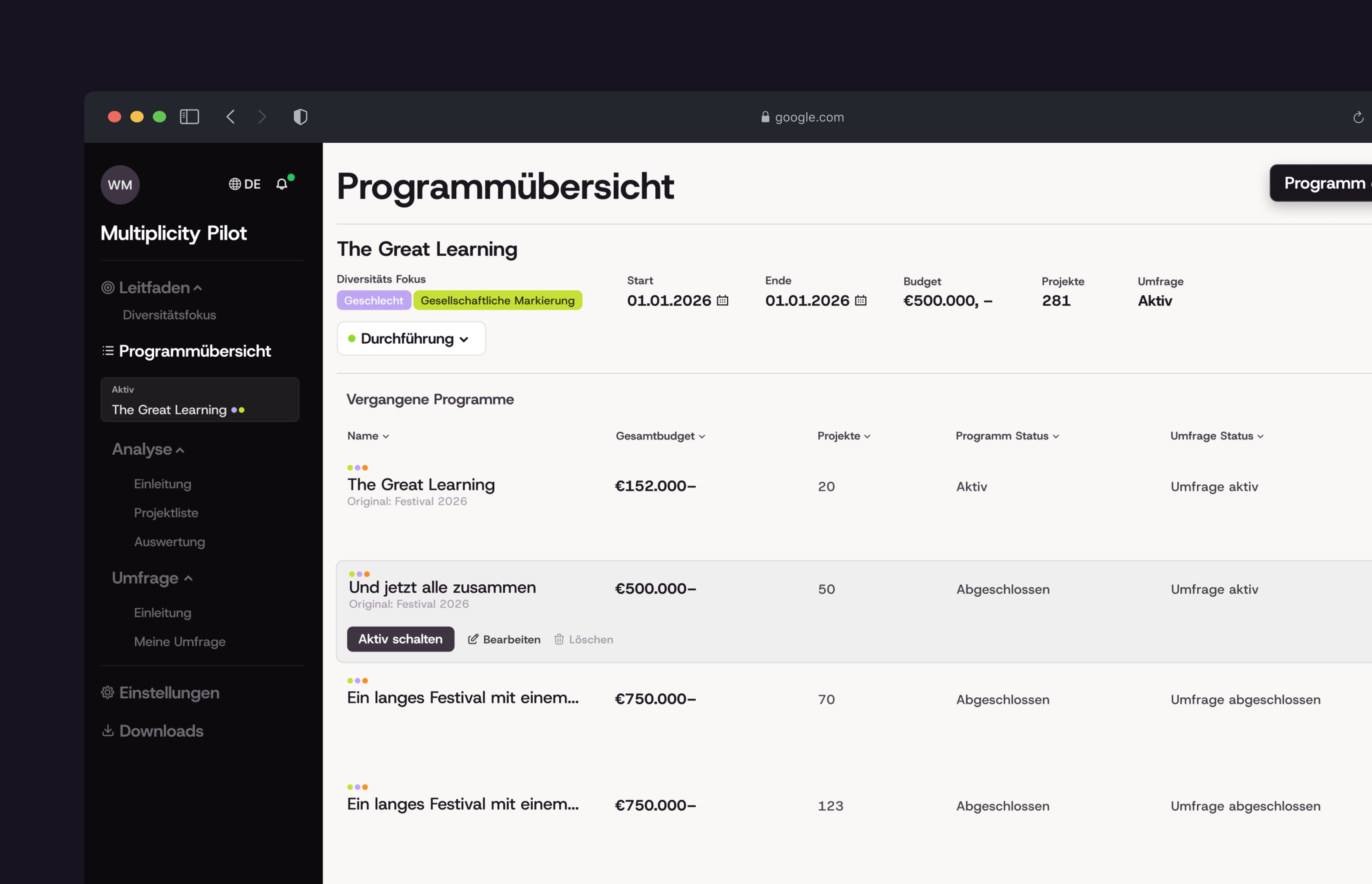
Assessing the current status
I joined the project at a later stage, bridging communication between Wien Modern and the technical team and taking over all product design, from user flows and user research to wireframes and screen design. I also translated Wien Modern's technical needs for the developers and advised them in meetings. To help fix the gap of communication I established a clear path moving forward:
- 01
Establish multiple in-person workshops
Since the project was already well underway but not yet heading in a workable direction, I started by analyzing all existing prototypes and sketches. Together with Wien Modern, I then developed a new page structure that reflected their expectations for the tool.
- 02
Detailed Wireframes and Userflow
To bring clear structure back into the project, I created a detailed user flow and wireframes. These had to be handed over to the tech company as quickly as possible, so they could begin the technical restructuring before the user interface was finalized.
- 03
Regular Check-Ins and Packages
While I developed the visual language and design, I helped Wien Modern define work packages that could run in parallel and clearly articulate their technical requirements, including a headless CMS, EU-based hosting and a security concept for sensitive data. I also supported them in meetings with the tech company, translating their ideas into concrete technical terms.
User Research
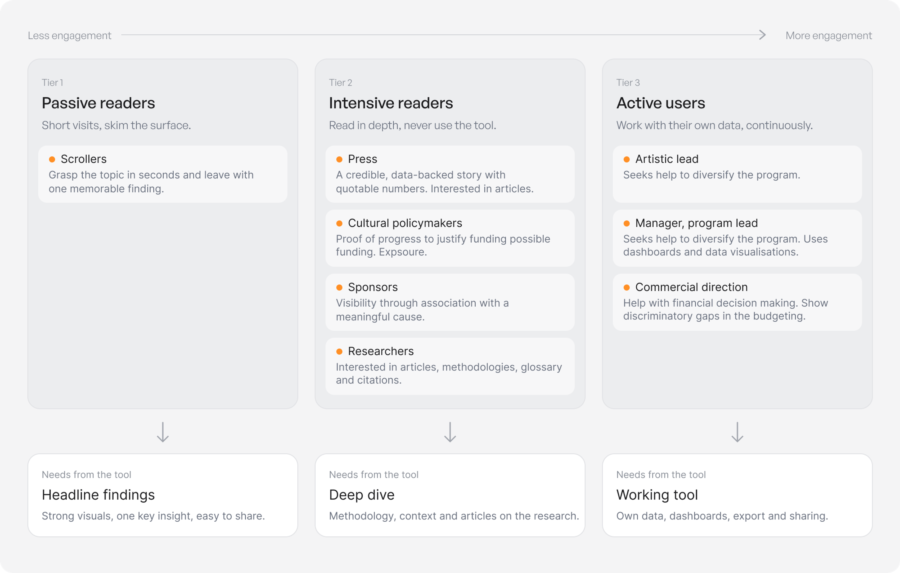
To understand who the tool was really for, I analysed its potential users in a workshop together with the team of Wien Modern and grouped them into three tiers based on their level of engagement: passive readers who skim for a quick headline finding, intensive readers such as press, policymakers, sponsors and researchers who want depth and context, and active users within cultural institutions who work with their own data. One of the key takeaways was to split the platform in two: an openly accessible landing page presenting the research findings, and a dashboard containing the actual tool, available only to users who have registered and completed the diversity check.
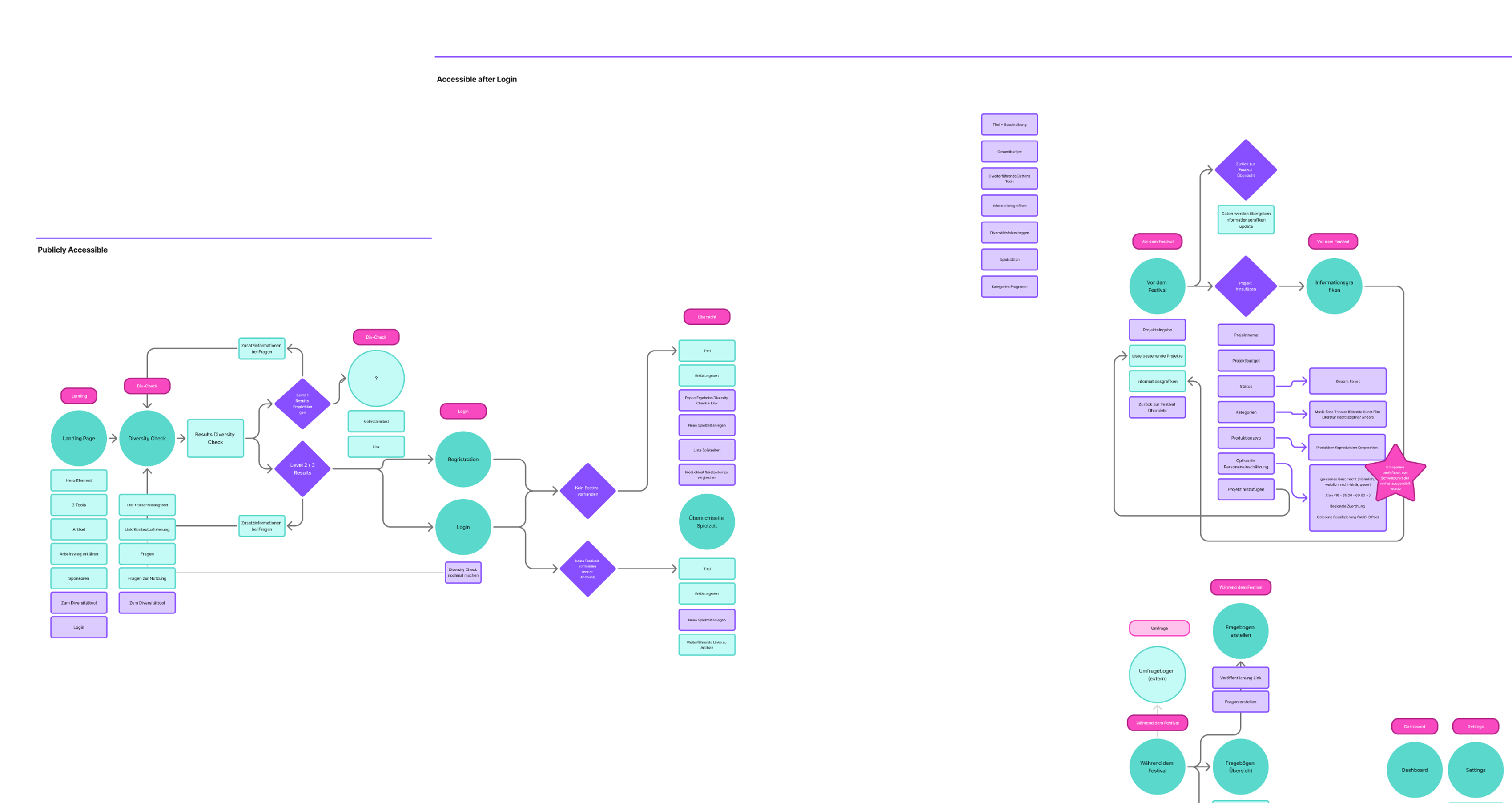
Planning a Userflow that works
Defining a working user flow was challenging, since the content and functionality were still under discussion. I used the user flow as a living tool to capture changes, map them out and identify potential problems early on.
Key Decisions
- After identifying the different user groups, I made the decision to split the project into a public landing page and a dashboard that is only accessible after successfully completing the diversity check and registering.
- The project had to be restructured at its core. Initially the project was planned to contain three tools that mirrored the different stages of the project. We decided to change this into two tools that split the functonalities originally designed for three.
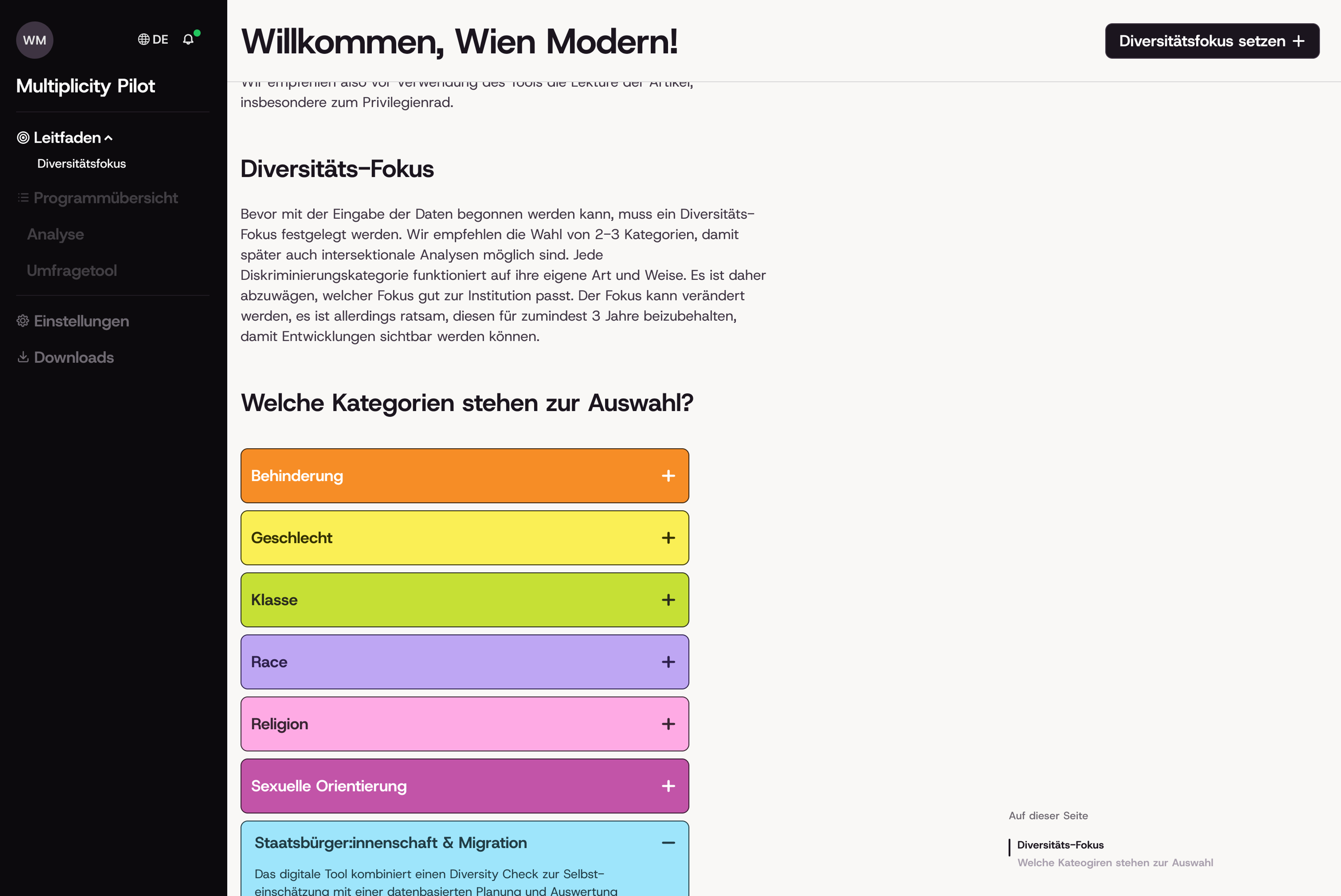
- Contextualization of sensitive language and topics was a key concern. We decided to add an intro page to each tool, that users are forced to read at least once before they get access to it. It contains important information and gives tips that avoid accidental unethical use.
- Inline contextualization with the help of side sheets
Wireframes
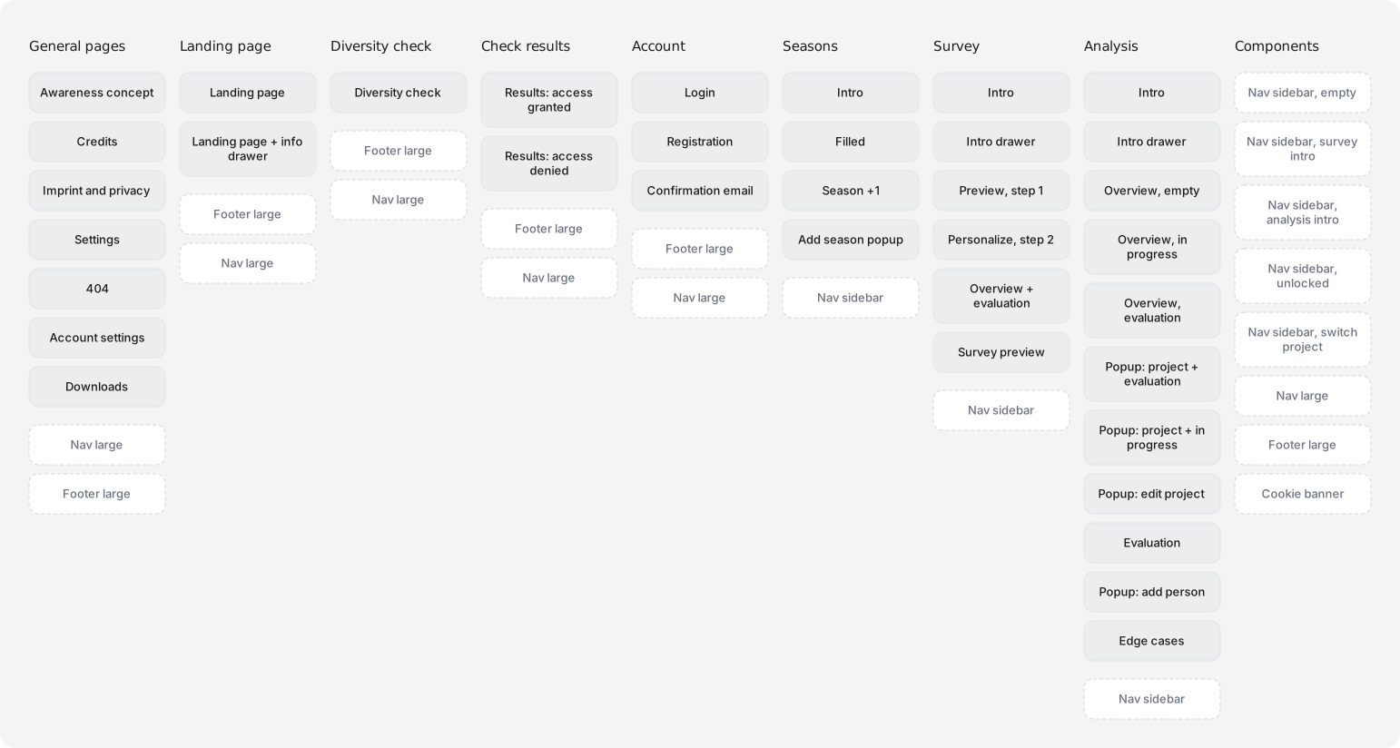
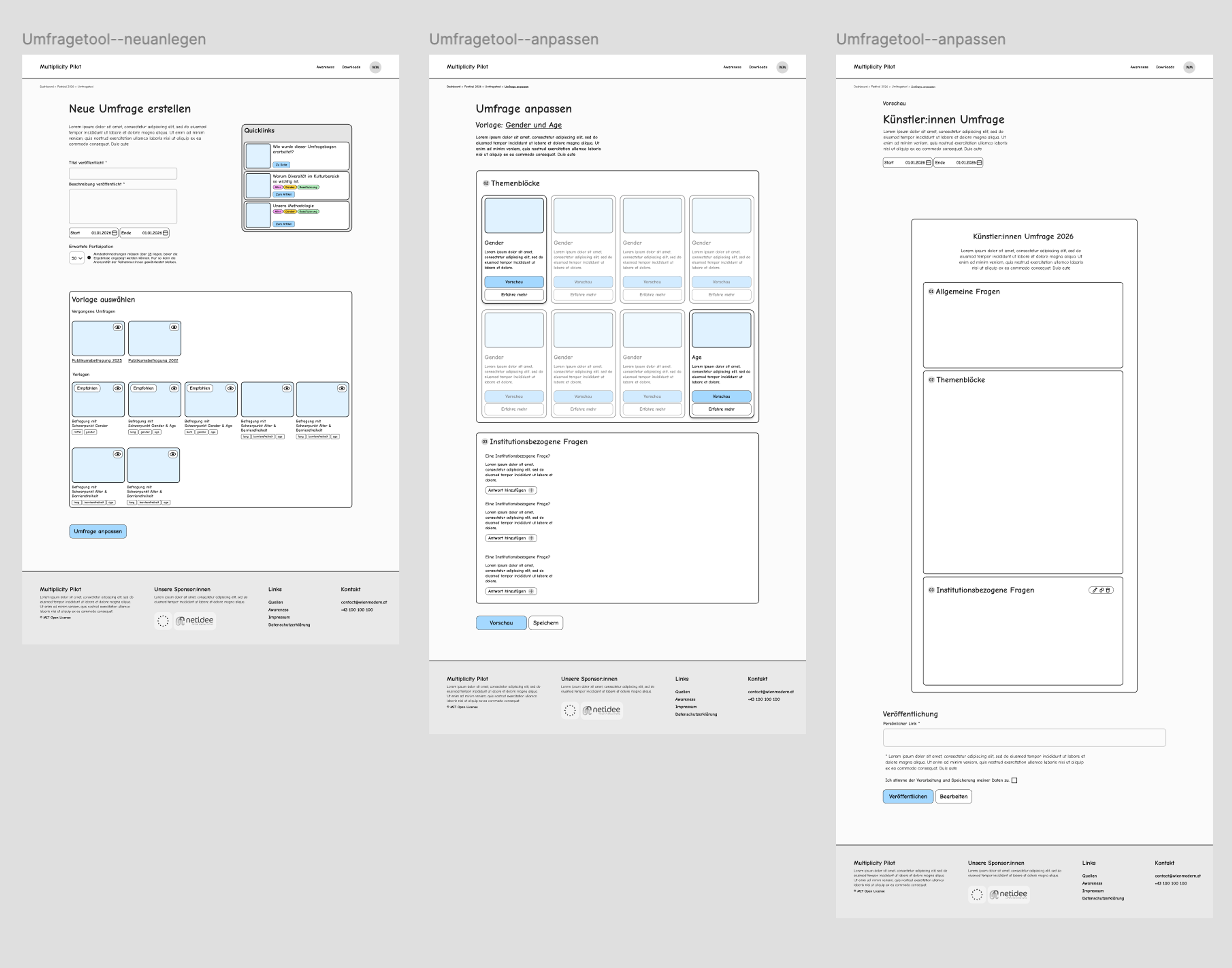
Once the new page structure was in place, I began working on detailed wireframes that already communicated the key functionality of the page to the developers, so they could restructure it while I was still working on the final screens. The wireframes also proved to be a great basis for discussing the current state of the project and figuring out what worked well and what needed refinement.
One of the biggest changes between the wireframes and the final designs was how user actions were contextualized. Since the project aims to help users make informed decisions that support the diversification of their programs, guiding them toward good decisions was crucial. The original plan was to contextualize most actions directly, or with information toggles placed next to them. Eventually, we decided to move to a dashboard-style layout and bundle most of the context into intro blocks that users read before proceeding to the actual tool.
Dashboard Design
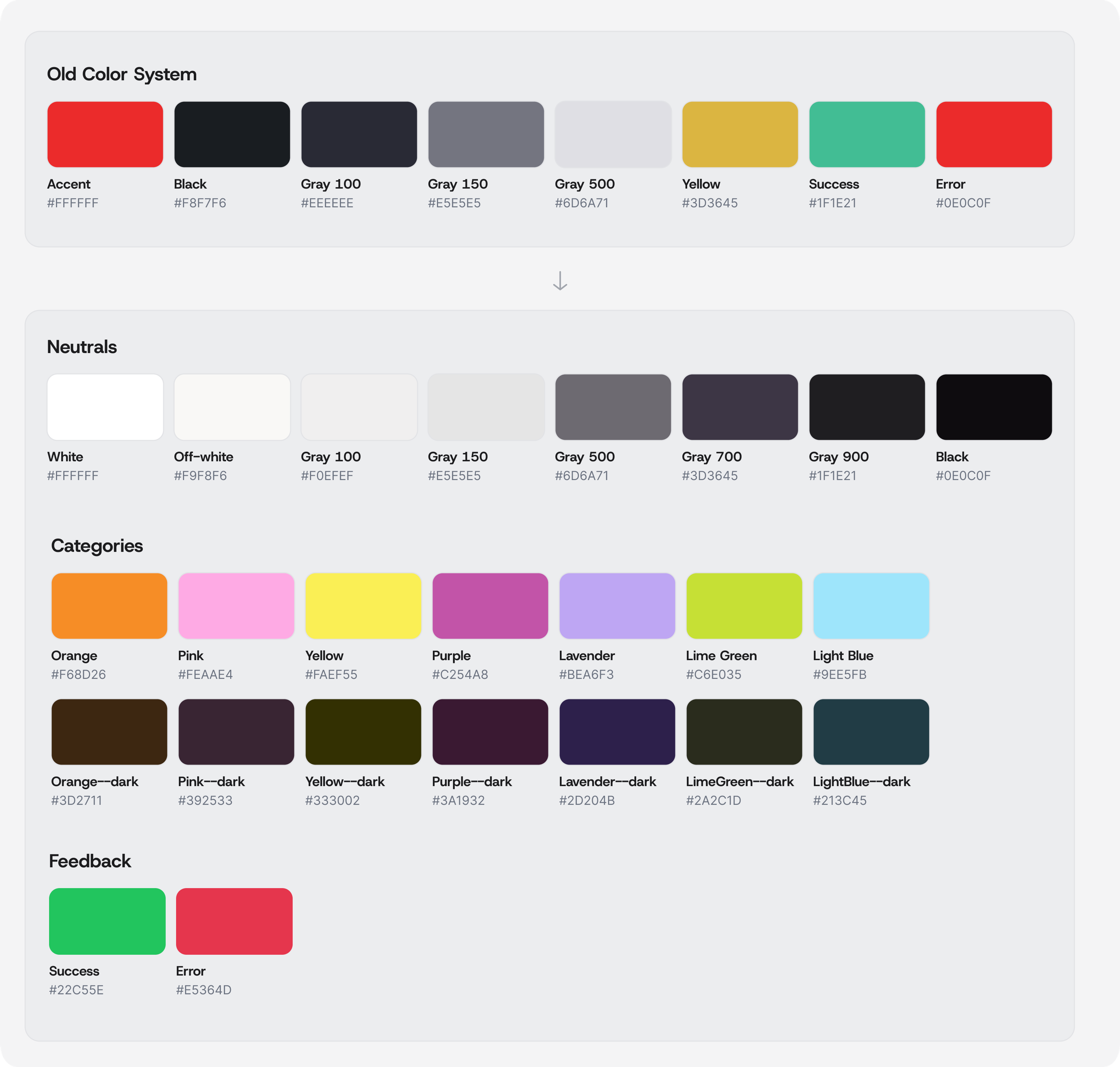
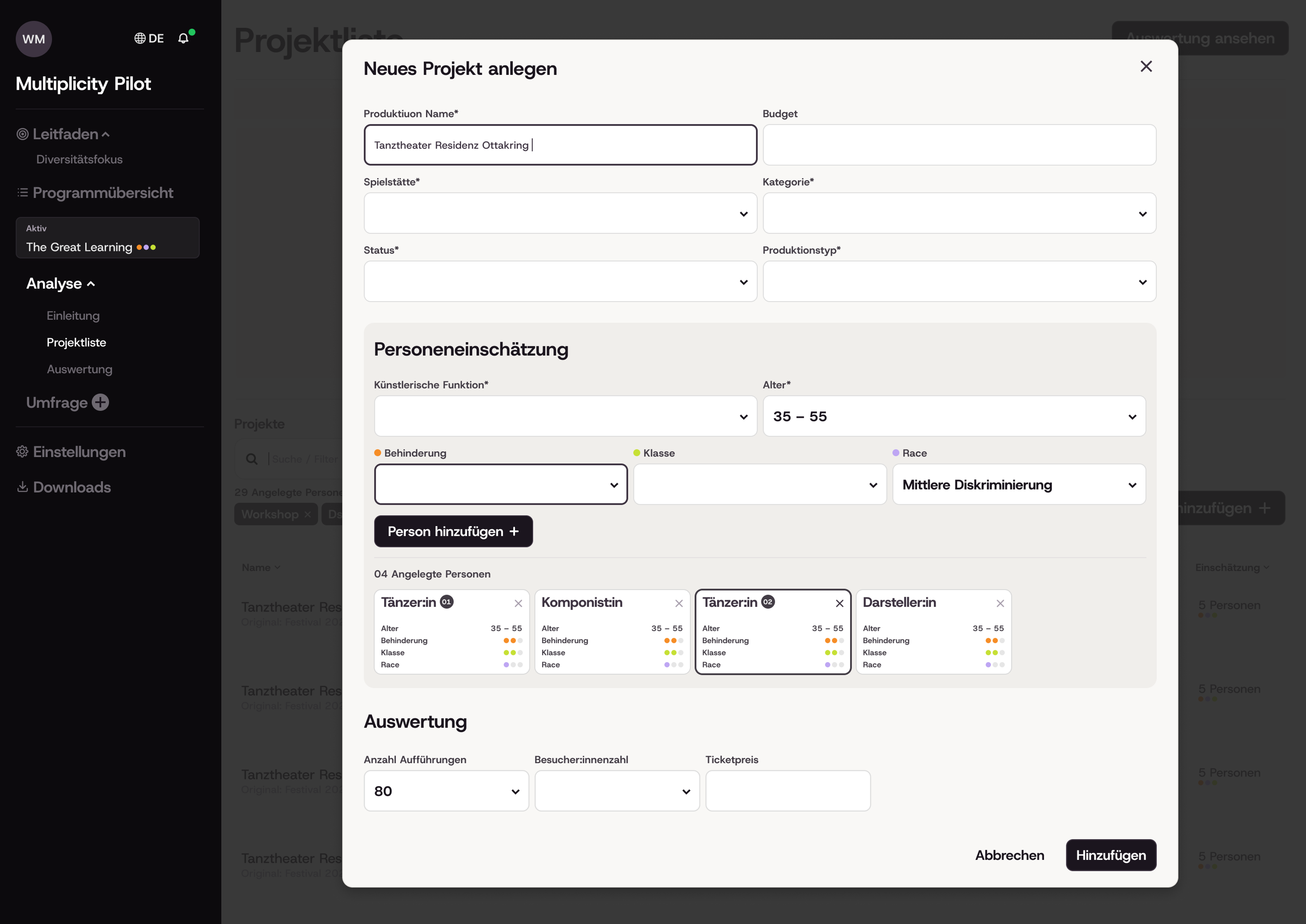
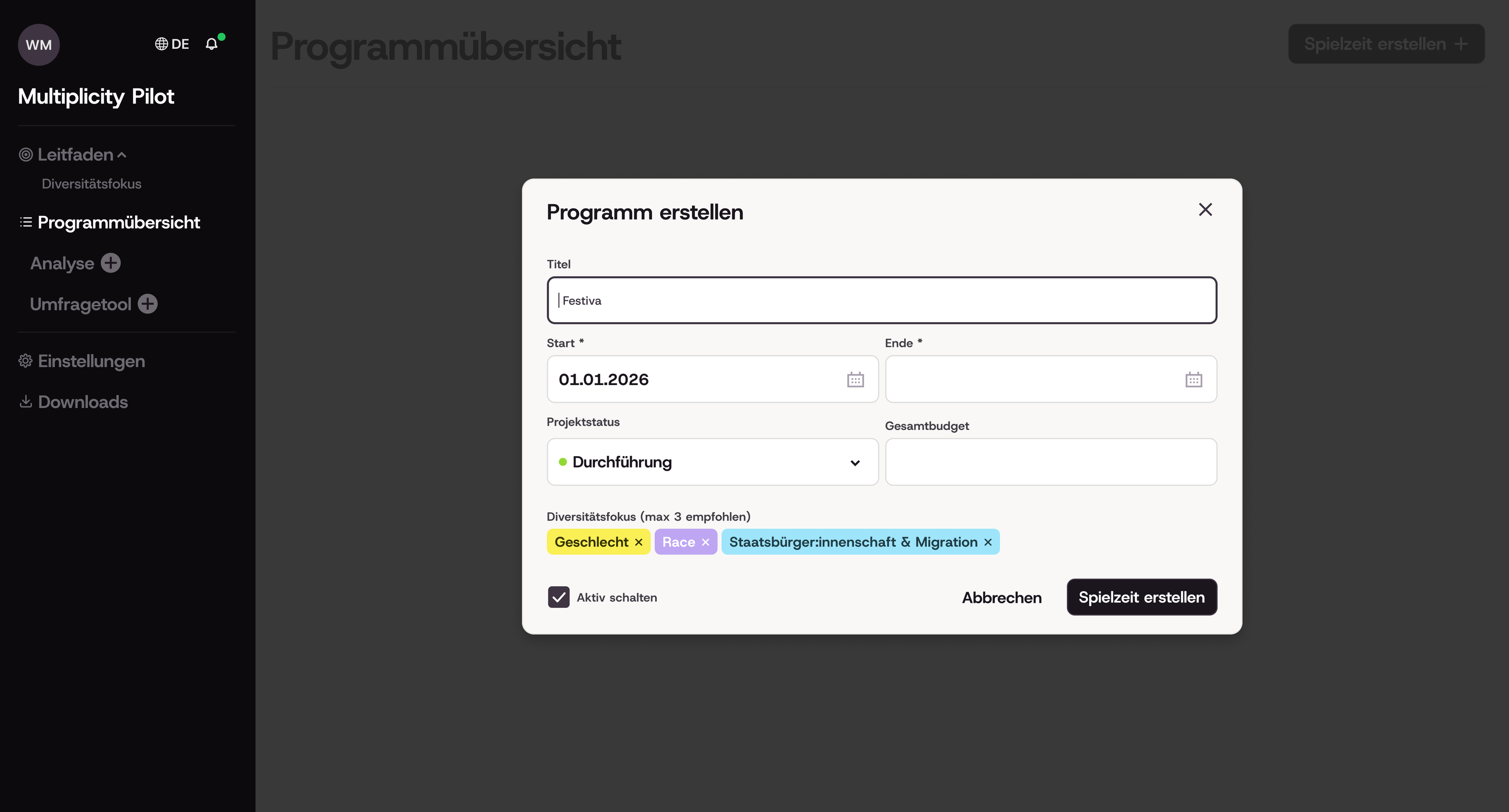
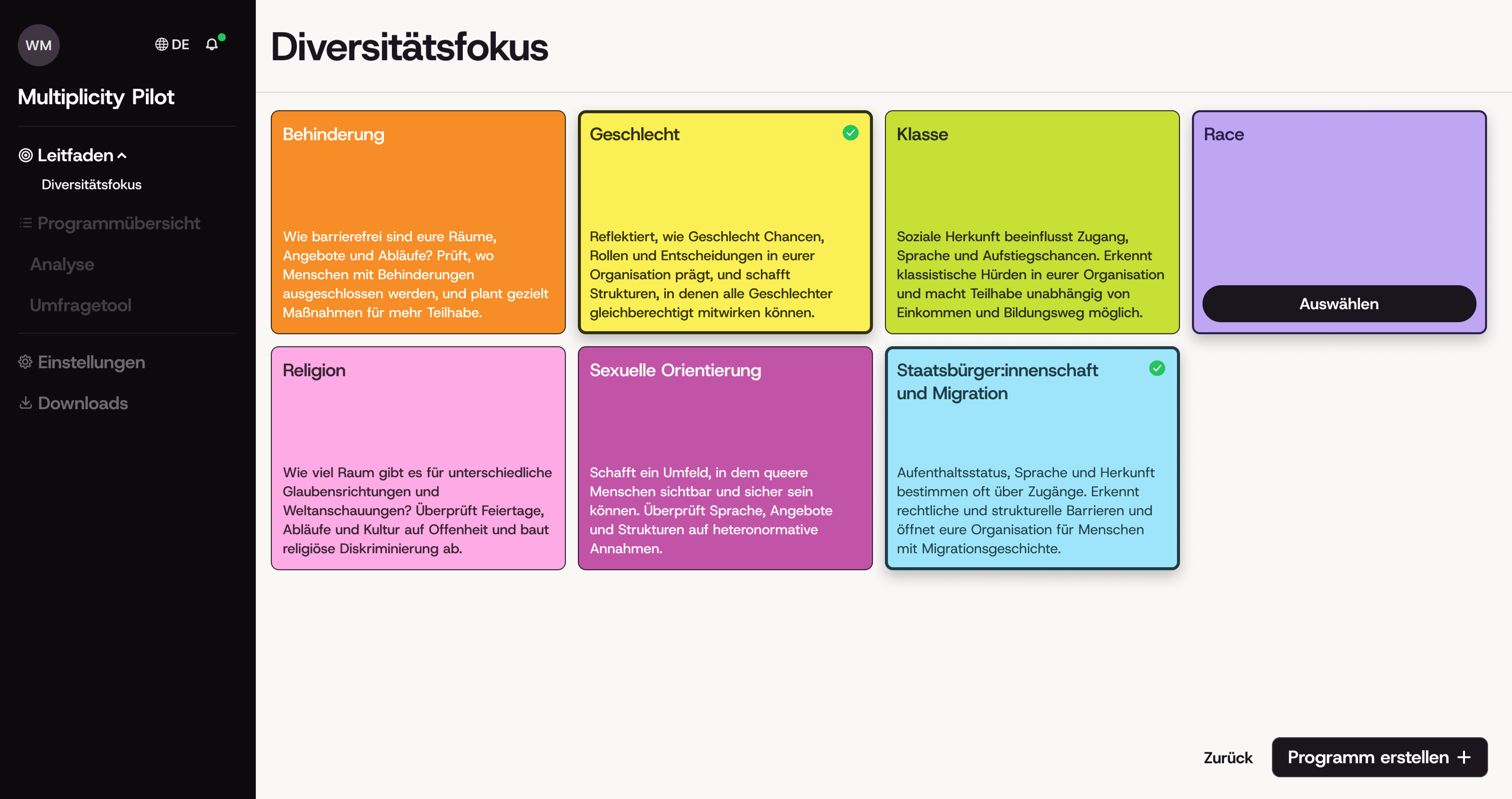
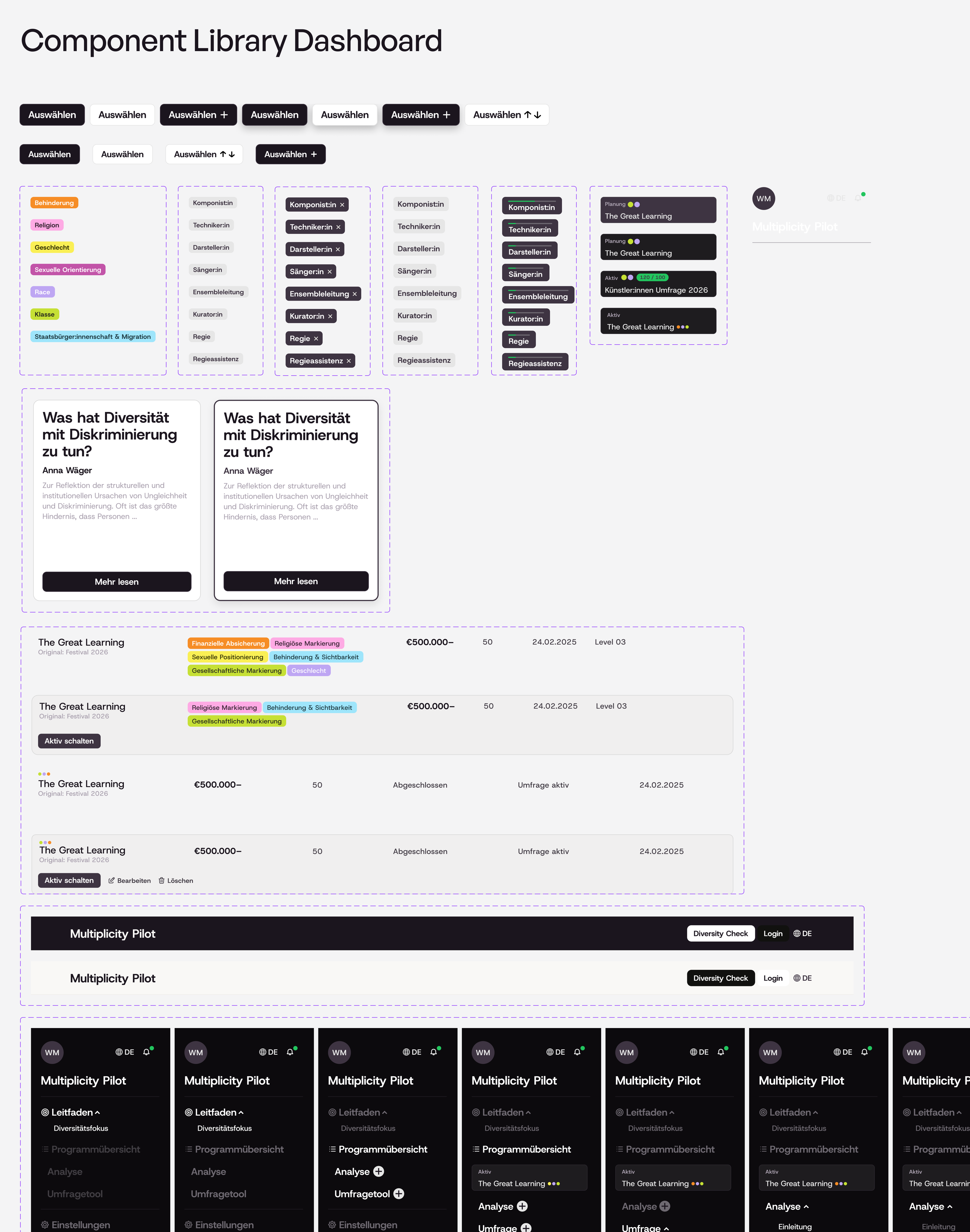
Before designing the dashboard, I defined a visual language built around seven key colors, each linked to a diversity category and paired with a darker shade for accents. To avoid confusion with these category colors, I used black for the main call to action within the dashboard.
Wien Modern explicitly asked for a more playful approach that would connect to the research they had conducted before the project started. I therefore shifted the original color palette to a lighter theme and added colors that conveyed lightness and diversity, while taking care not to reinforce societal stereotypes, such as using pink for gender. To emphasise the more playful (and namely “less techy”) approach I decided to use bigger font styles for many UI elements, as well as thick dark corners for elements in focus, or certain cards. As the project continues to grow I would like to include small illustrations.
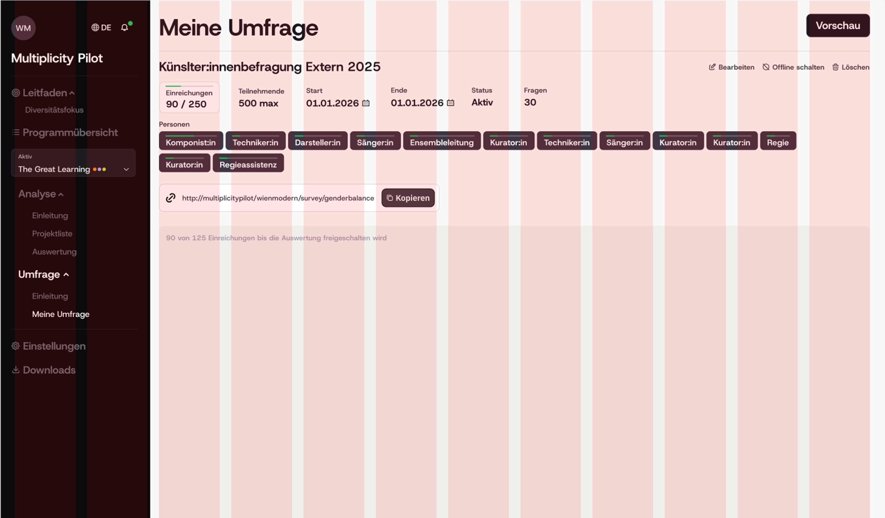
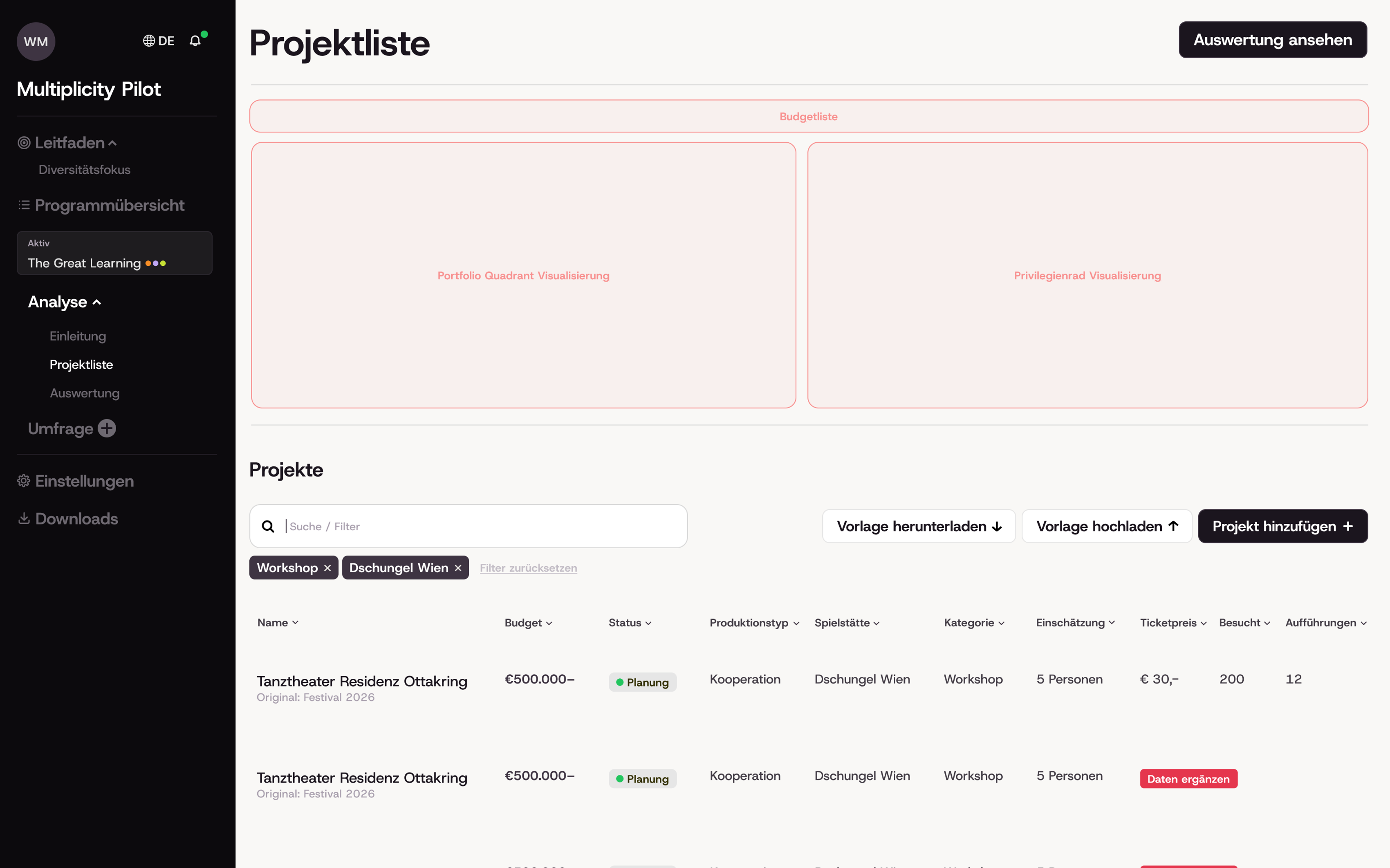
A big part of the app's appeal lies in its information graphics. At the current stage of the project, these have not yet been finalized by the tech company and will be added once they have been signed off. Until then, the design has been built around them, with dedicated space reserved for their later integration.
Key Features
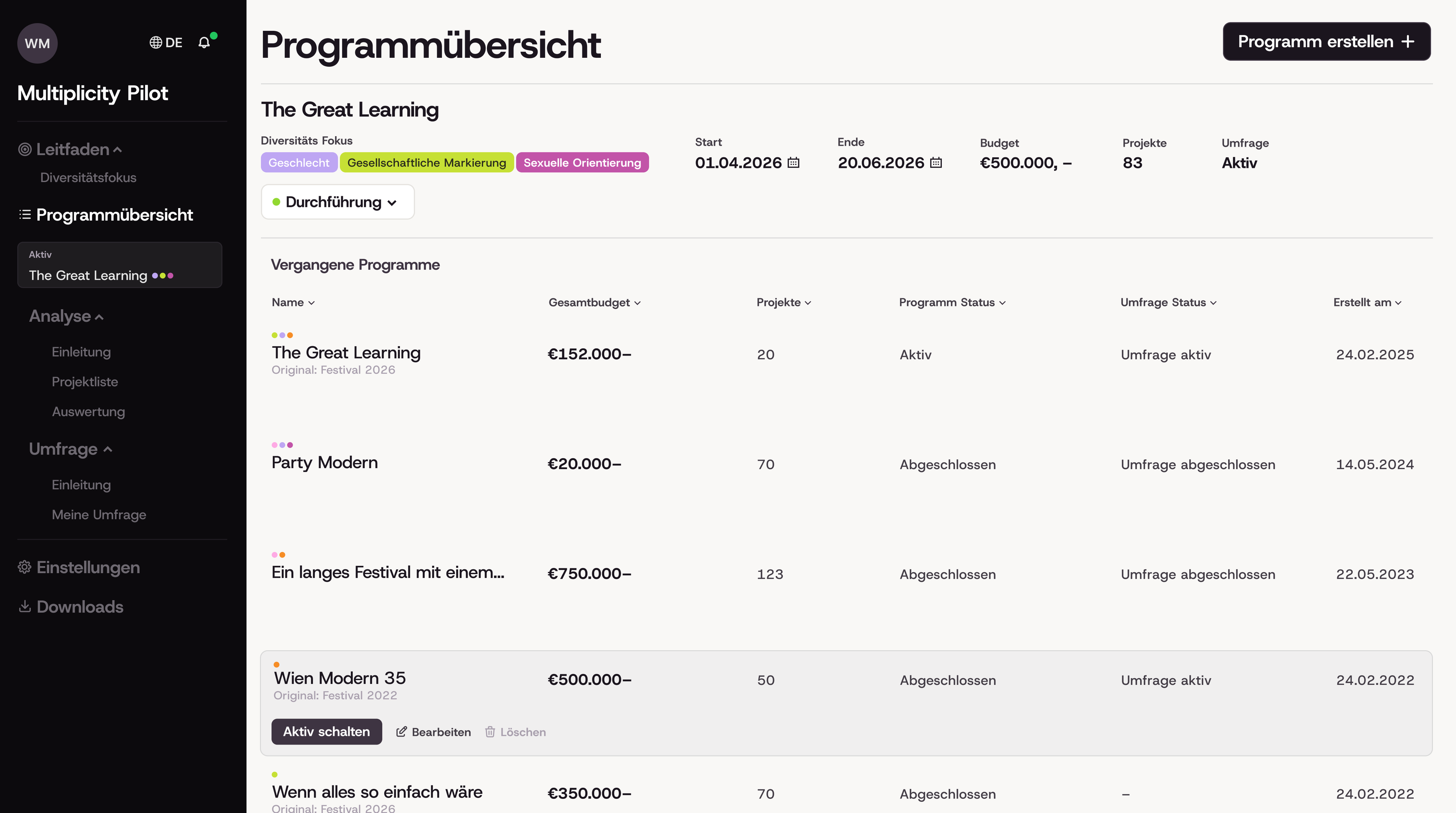
- "Diversity Focus" can be assigned in a specific window and predetermines the selection of all connected tools inside the interface
- Dashboard Navigation that mirrors the status of the current program and renders an overview page unnesseary.
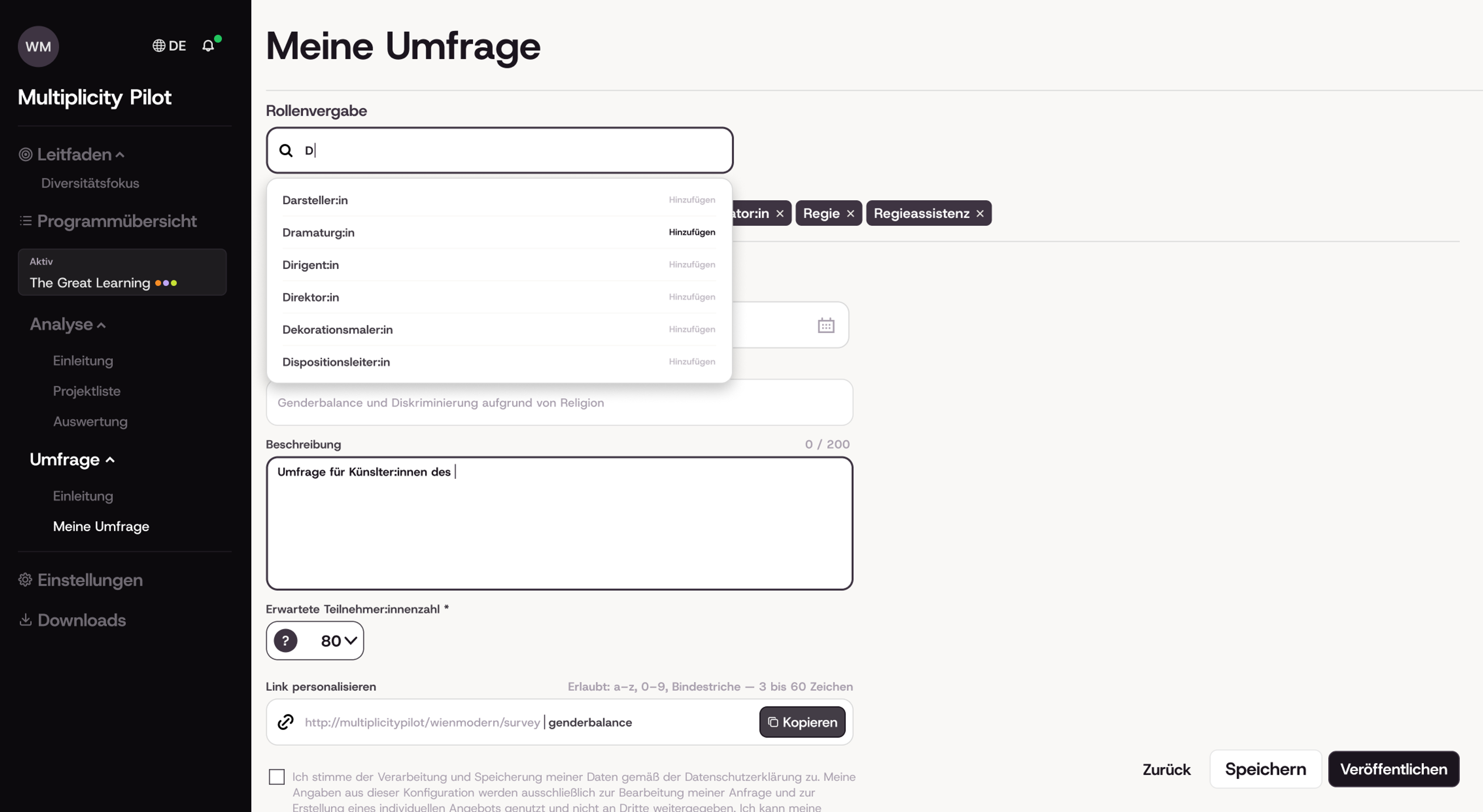
- An intelligent search that provide suggestions and autocompletes written language
- Side drawer that provides additional information
Moving on
The project is still in progress and will be finalized in November 2026. The landing page, the information design (developed externally) and the final technical implementation are all still under construction.
The project team has applied for additional funding, which would allow for a more thorough awareness concept and a stronger integration of information visualizations such as the diversity wheel. The next phase is testing, during which the tool will be shared with other cultural organizations and evaluated for its usability.