Homahuki is a web app built to take the admin work off creative people's plates. Homahuki uses optical character recognition (OCR) to scan these documents, pick out the relevant information, and route it automatically into the right place in the user's creative workflow, whether that meant logging a bill, adding an event to the calendar, or filing an idea into a brainstorming board.
Unlike generic productivity tools, the app was designed around how creatives actually work, adapting to their individual pipelines rather than forcing them into a rigid system.
The challenge
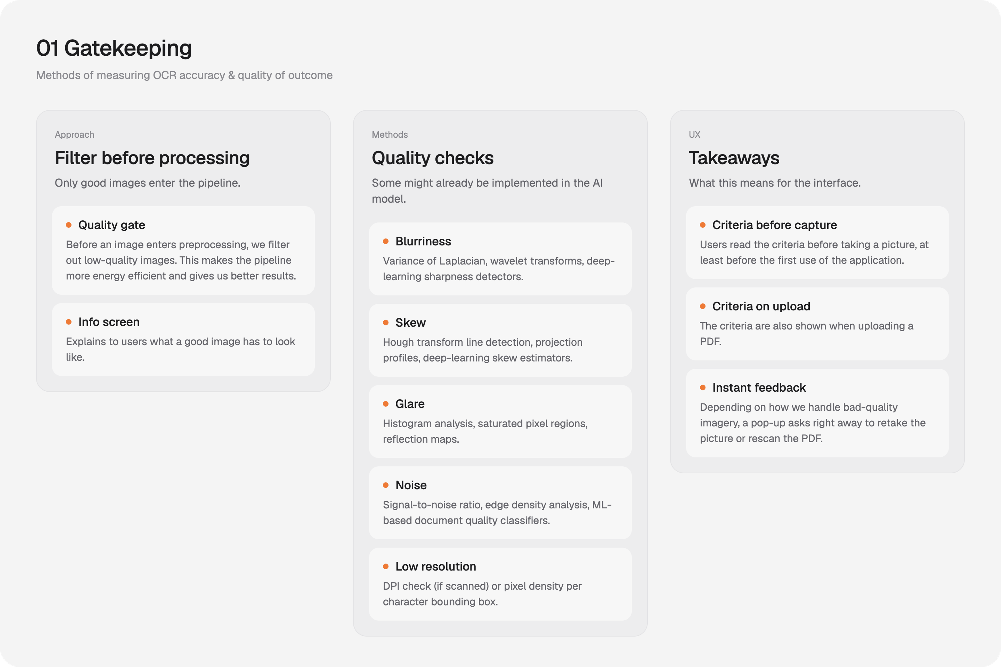
Before starting to plan the design process, I needed to understand the technology well enough to make informed product decisions, and to design an experience that would work with its limitations rather than hide them. I did extensive research into different Object Character Recognition pipelines and their limitations, and wrote down the differences between AI based OCR and classic OCR. Every decision I made in the design process was based on this research, that needed to be structured into: key take-away, UX take-away and technical take-away. I learned about Gatekeeping checks, Preprocessing pipelines and mapped out different loading times for various tasks.
I was responsible for both the technical architecture of the image processing pipeline (that is strongly connected to user interaction) and the userflow. It was highly challenging, yet necessary to design both of them at the same time. Every technical decision directly influenced the User-Experience (Unnecessary steps in processing, long loading times, clear node connections) and hat to be handled with care.
Therefore one of the biggest challenges for the UX part of the project was to find a way to communicate the technicalities of the application to the user (especially those that can be frustrating like loading times) without overwhelming them with technical language.
- 01
Research
In depth research on Optical Character Recognition, best practices and competitors.
- 02
Image processing pipeline
Developing of the technical structure of the image processing pipeline, that is directly connected to the userexperience.
- 03
Userflow
Integrating the userflow into the image processing pipeline. Identifying where those interact, where technical processes become visible and where they move to the background.
- 04
Wireframes
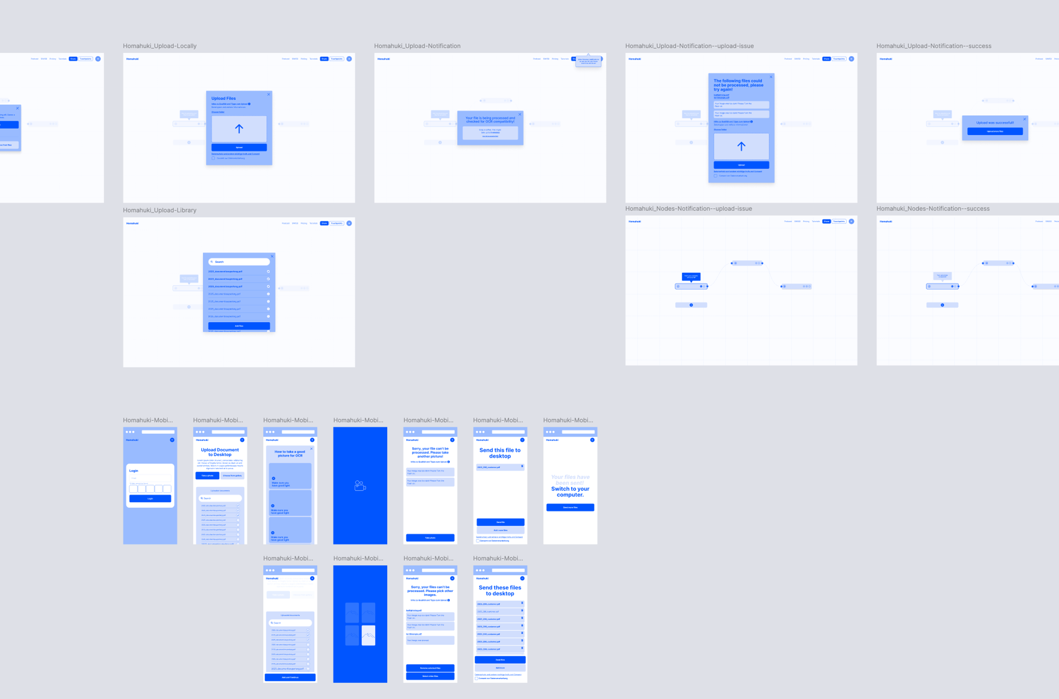
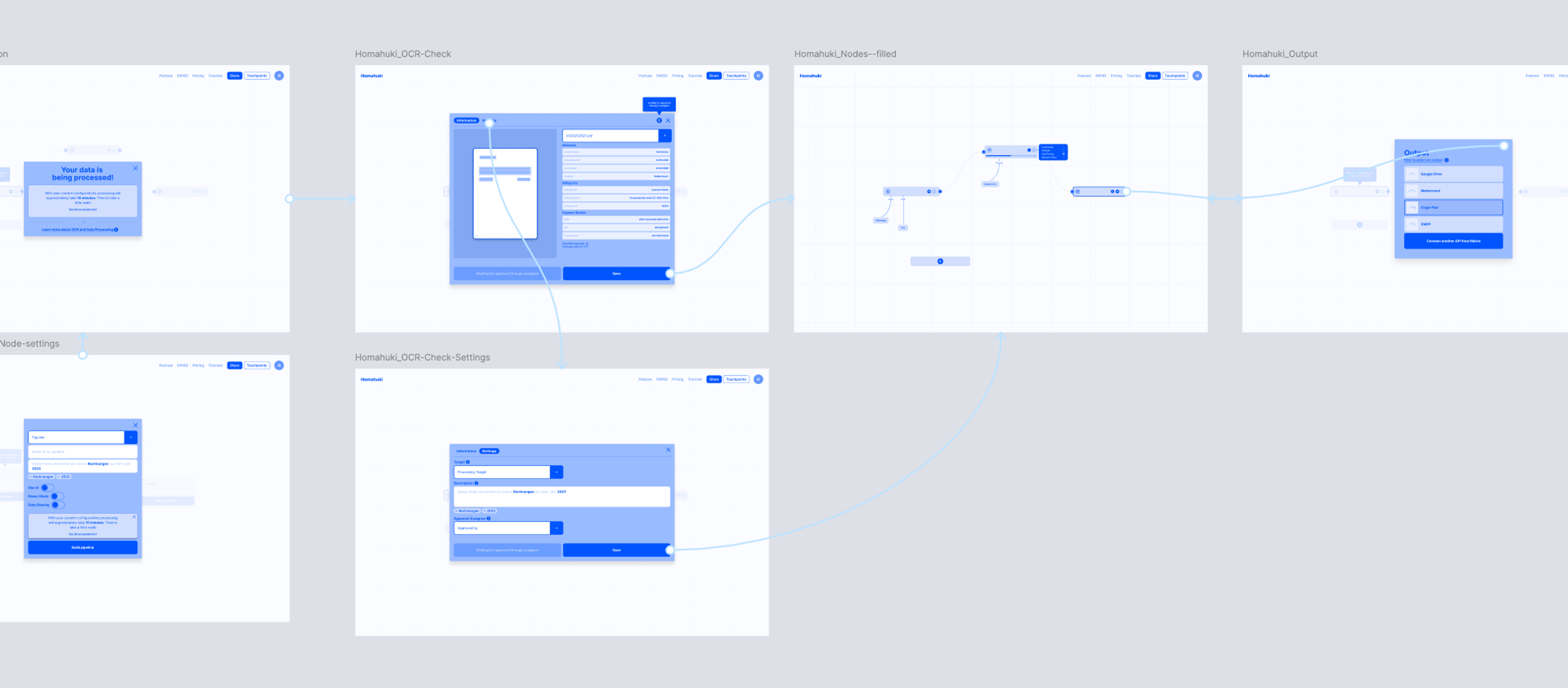
Development of Wireframes for desktop and mobile, inclduing a complex node-based editor.
- 05
Next Step: Interviews and User Research
Since the project was temporarily stopped, before completion this step has yet to be conducted.
My approach
I split the project into different phases, starting with research, that directly connected to the design of the first drafts of a functioning image processing pipeline and userflow. For each technical question, I noted what I learned, the product recommendation that followed, and what it meant for the user experience. Questions that needed input from the founder, such as whether to support handwriting, I flagged separately so they could be decided early.
Before I could move on to design wireframes, I had multiple in-person meetings with the founder clearing up technical questions and sharpening my understanding of the targeted user group.
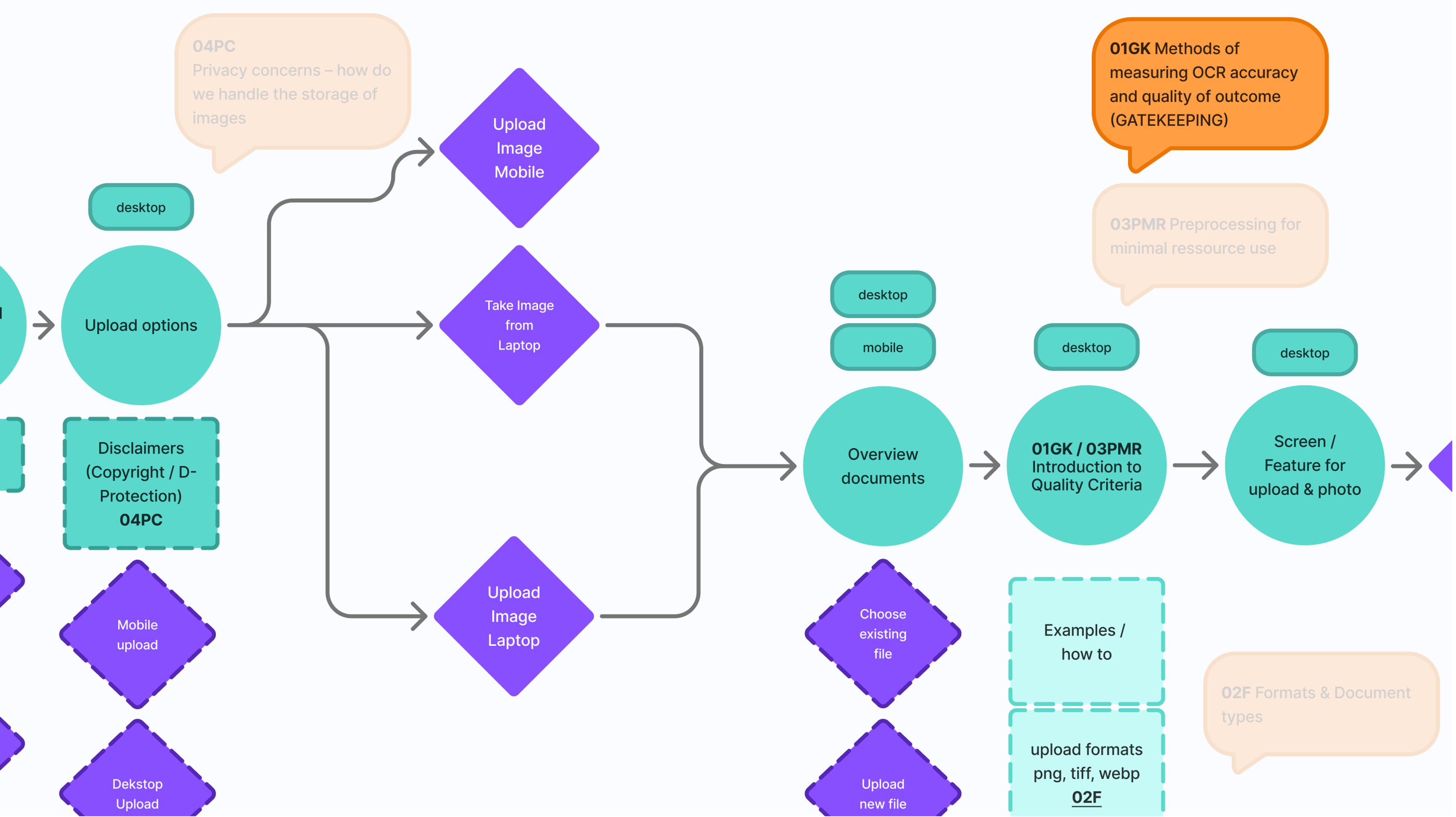
Screenshot of the decision making process in the early stages of the user flow development
System and flows
With the key decisions in place, I mapped the complete
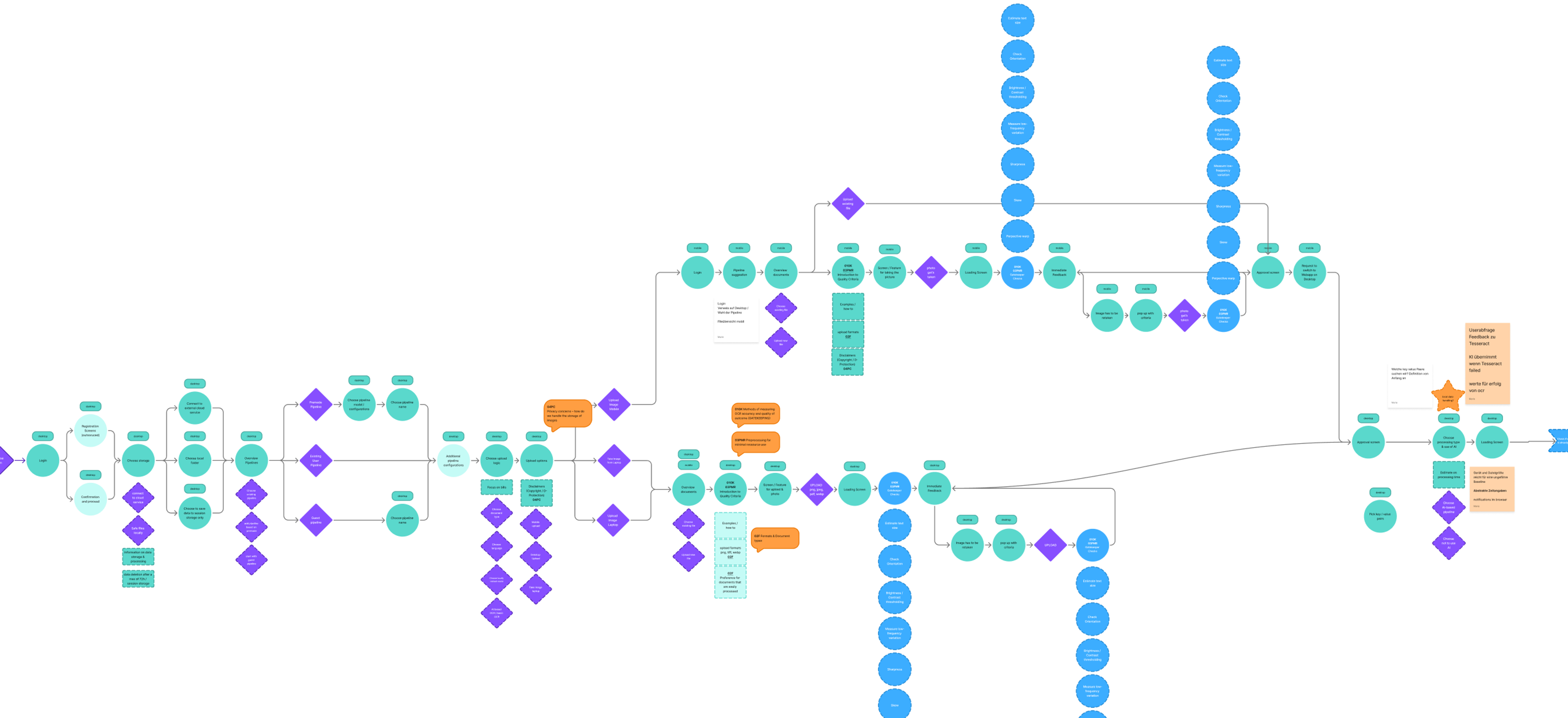
system: the user journey from upload to result, the decision points where documents pass or fail quality checks, and how extracted data moves through the processing pipeline into the user's workflow. Designing user- and technical flows side by side meant every error state and edge case had a planned response. I found it especially challenging to keep a good balance between informing users about technical happenings and hiding them from them, if deemed unnecessary for a successful user journey.
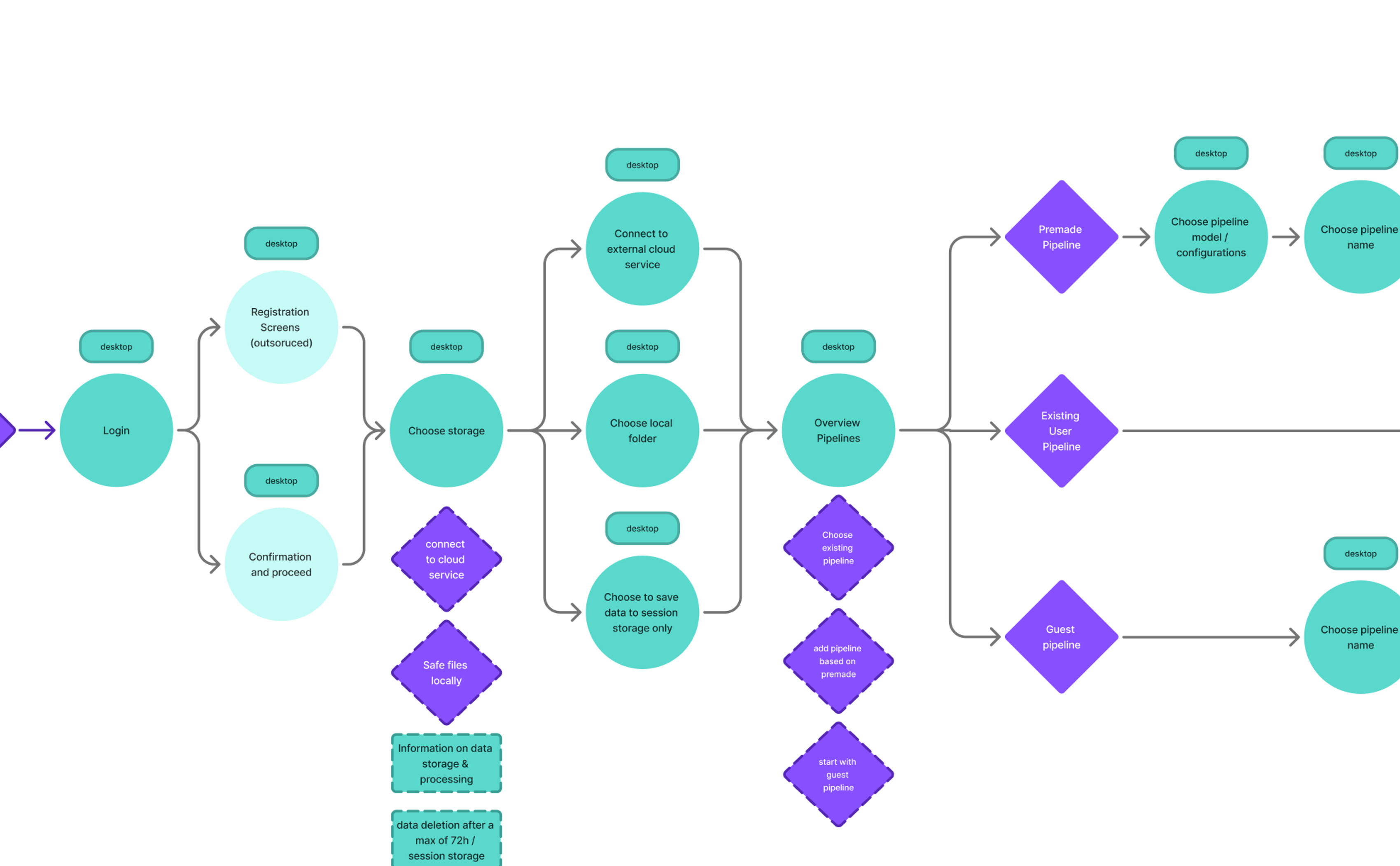
Screenshot of the userflow (zoomed in)
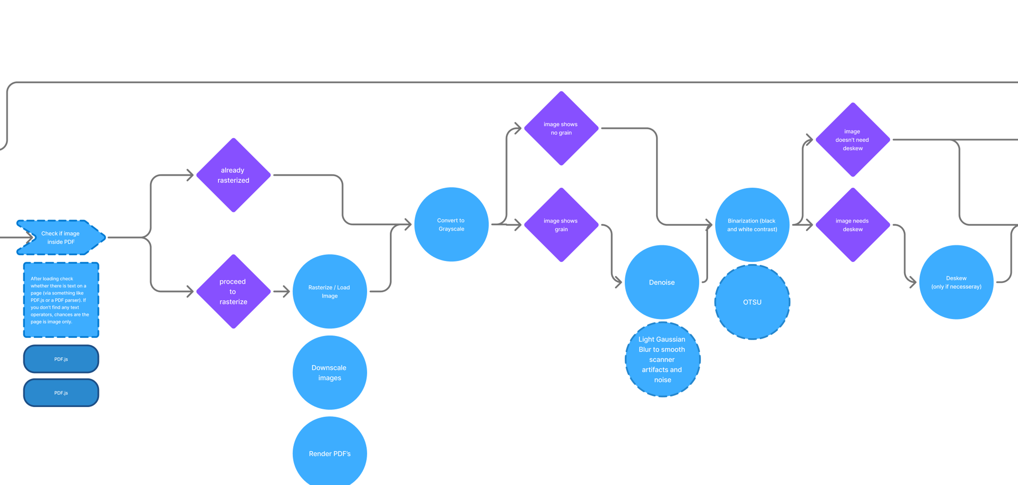
Screenshot of the image processing pipeline (zoomed in on Gatekeeping)
Wireframes
I brought everything together in wireframes for desktop and mobile, covering the core experience: uploading documents, processing and loading states, error handling, the document overview, and configurable pipelines that let users define where different types of information should go. The main interface of the application was a simple node-editor that easily connect different processing states with each other and offers immediate feedback.
Key Features
- Immediate Feedback and visible error messages
- Node System
- Interactive Figma prototype
- Mobile and Desktop Flows
- Messages that encourage users to take breaks during loading times
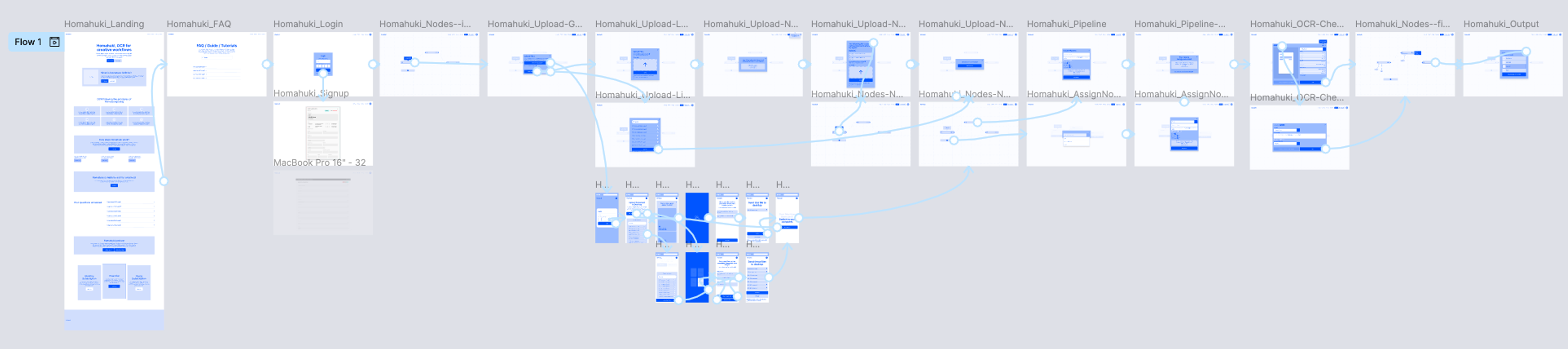
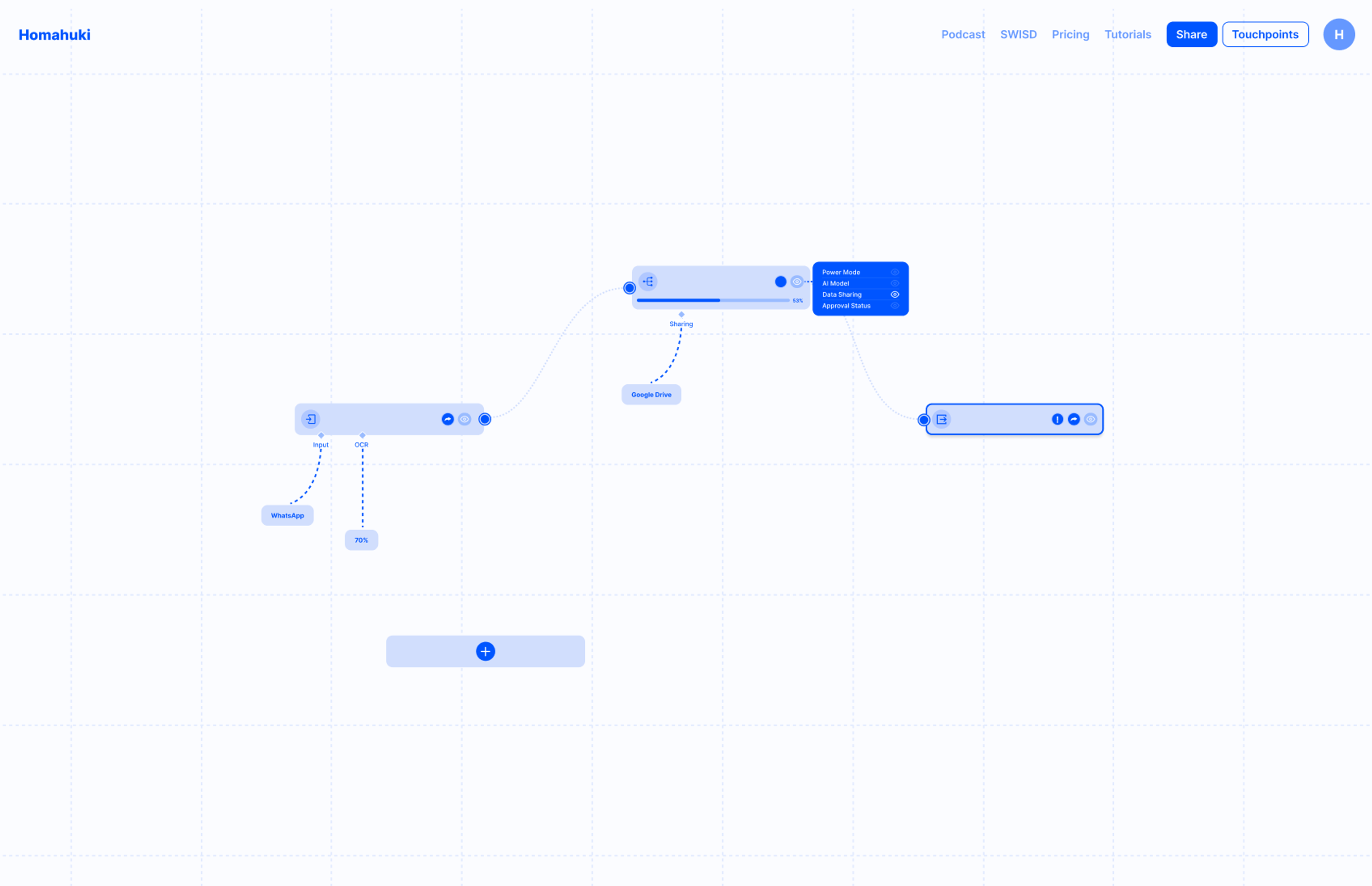
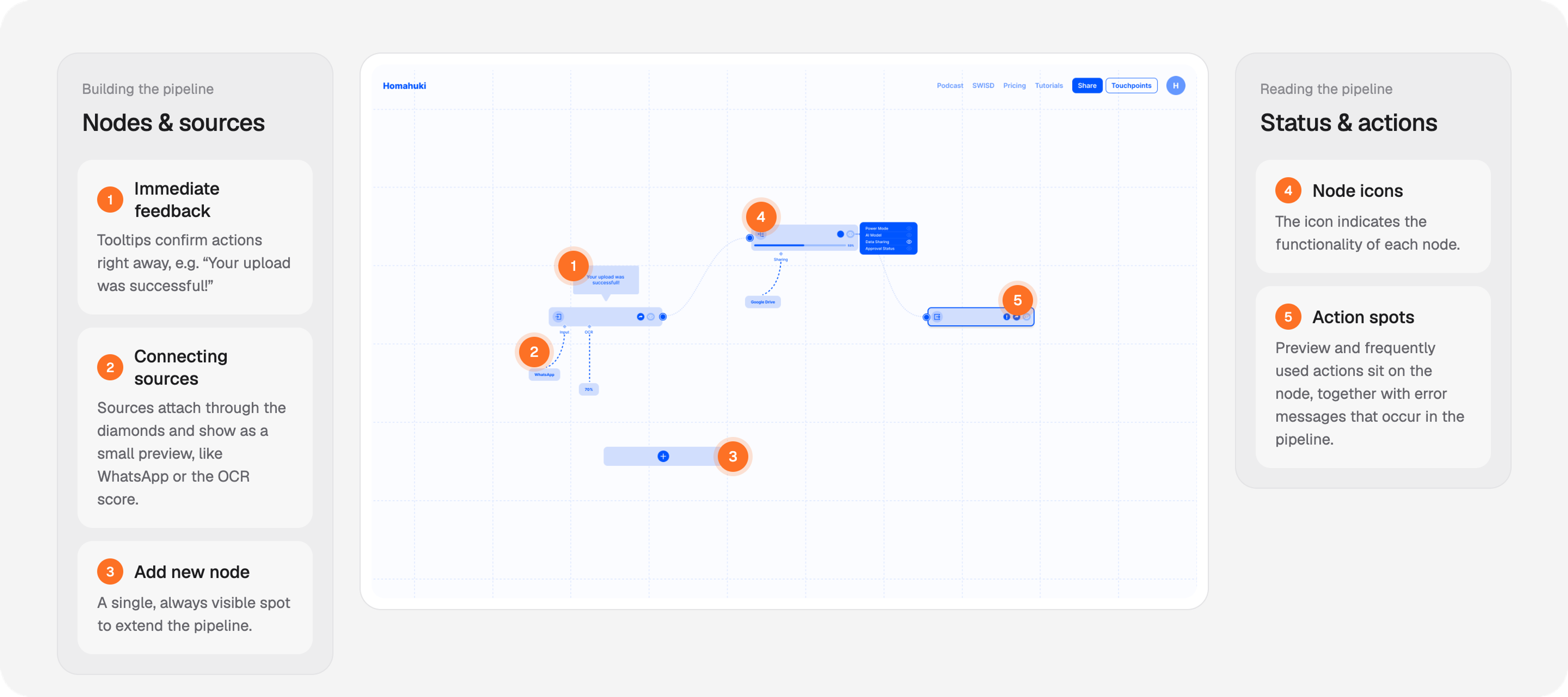
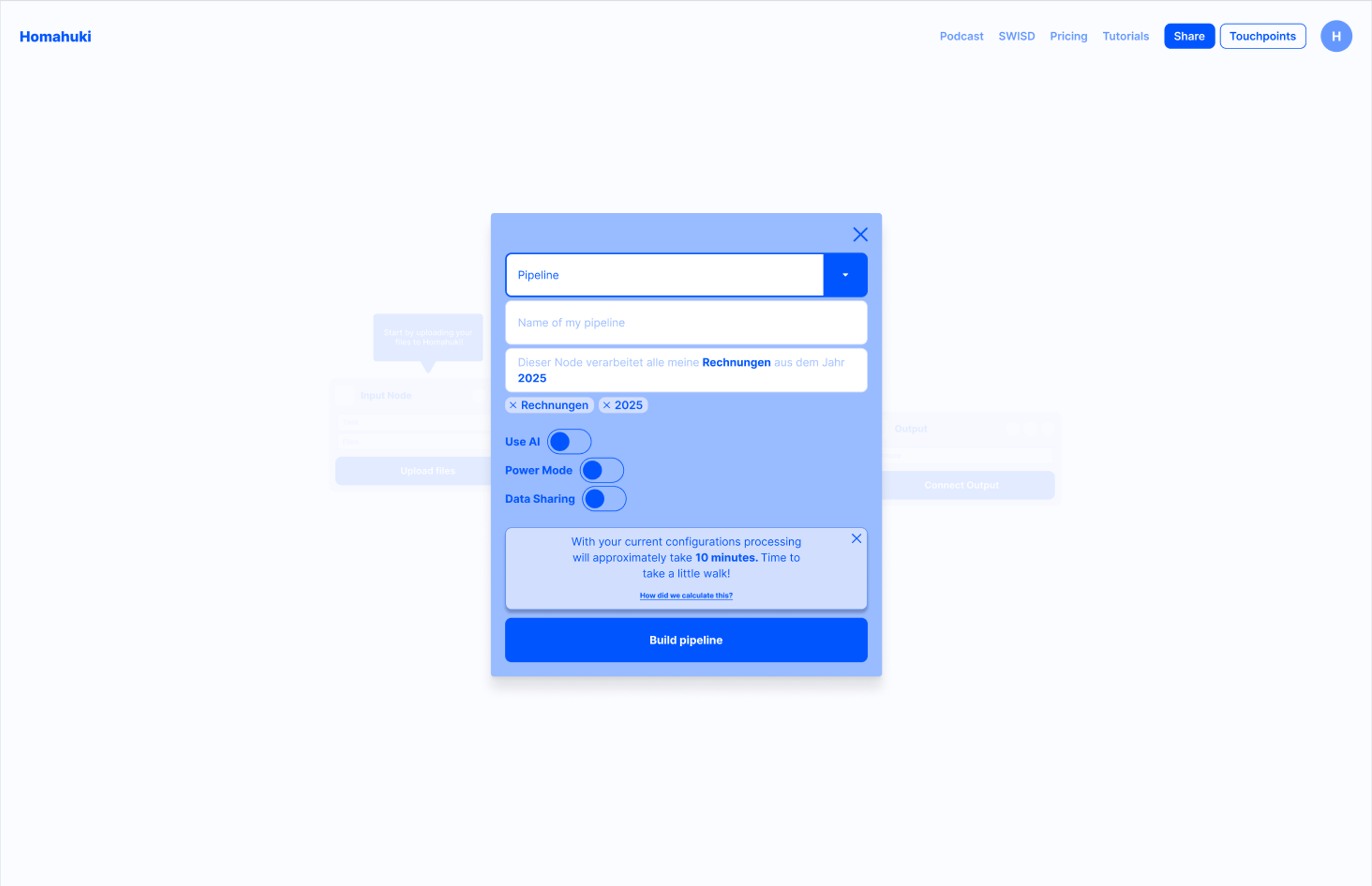
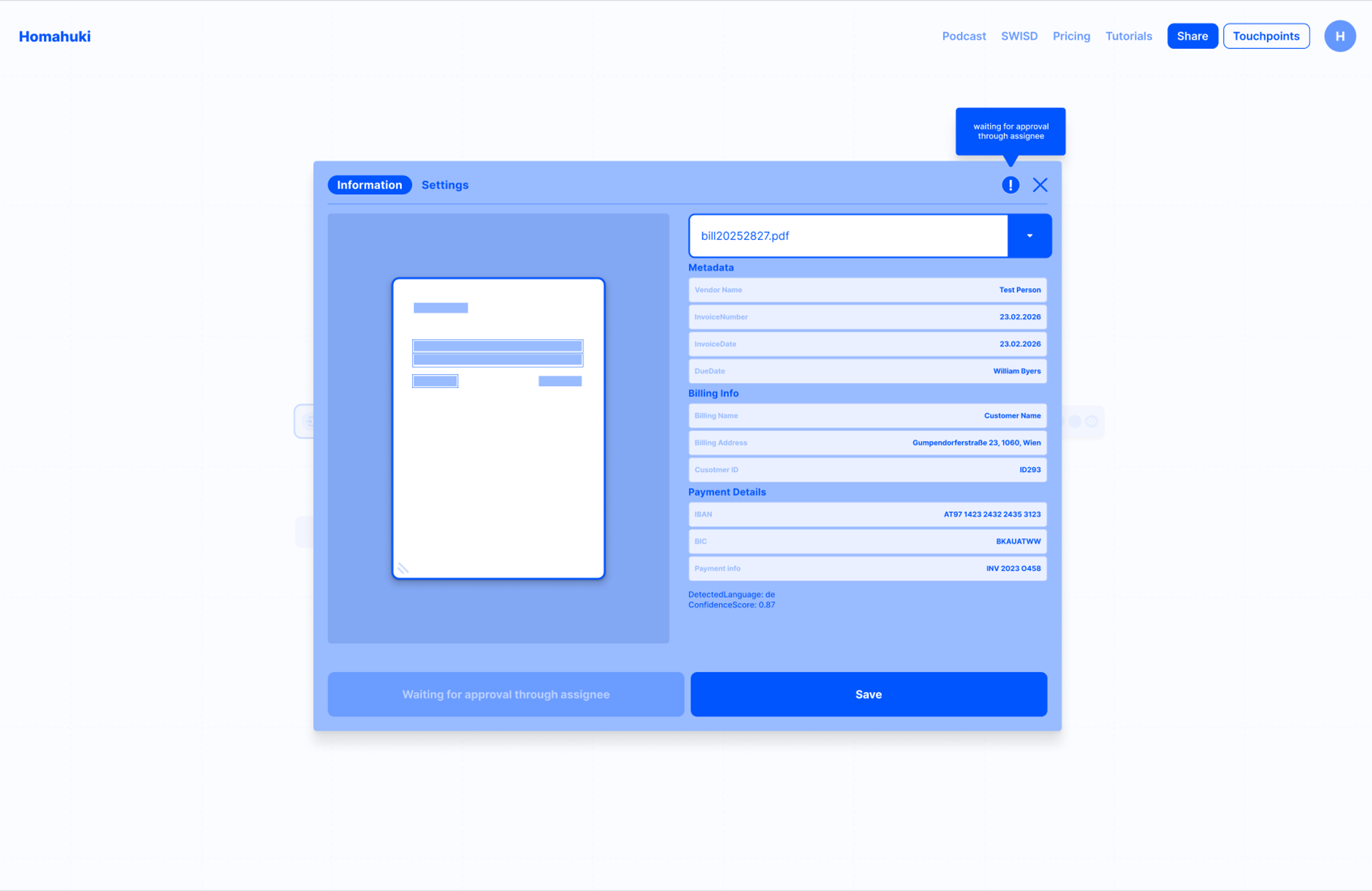
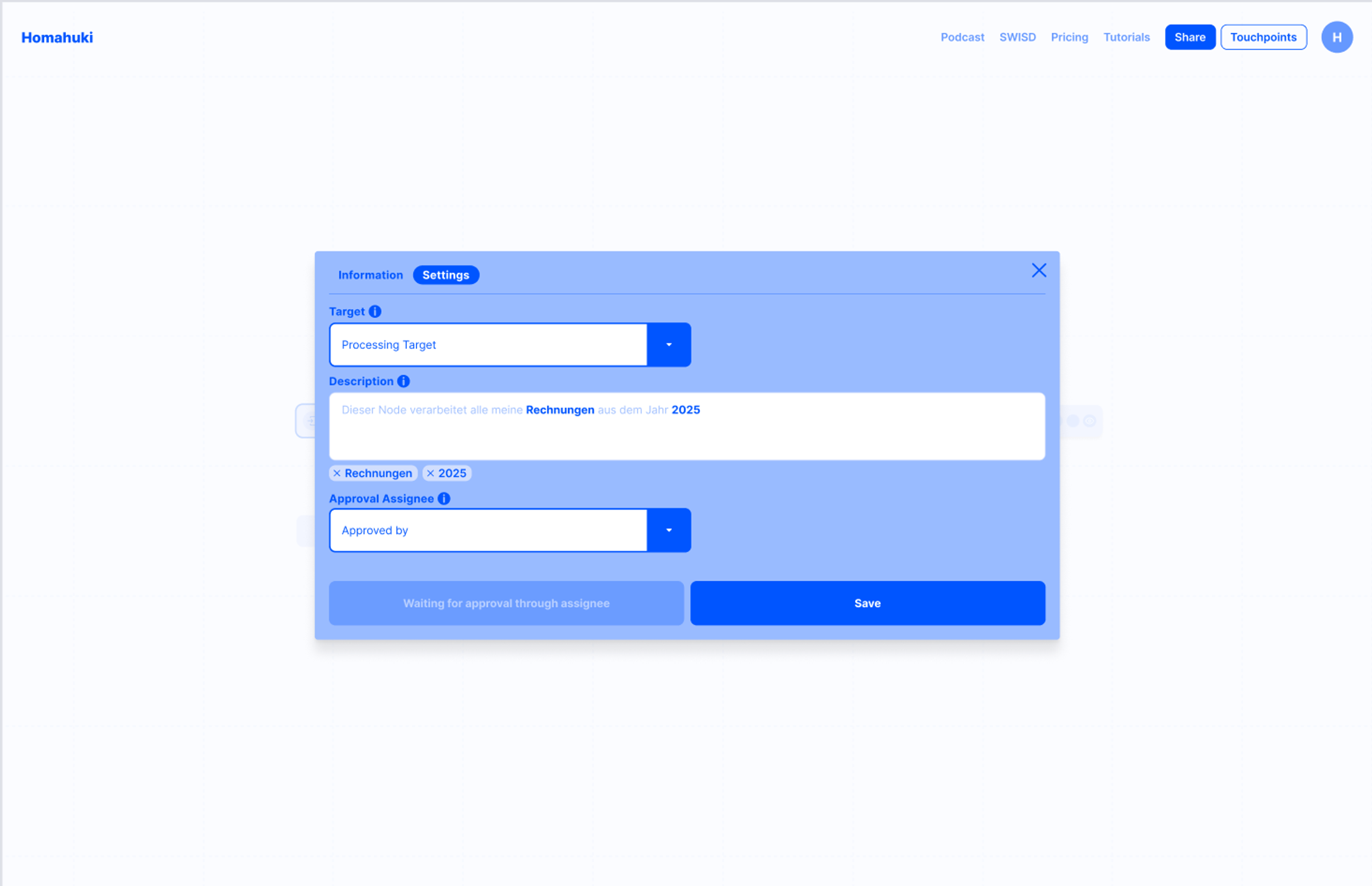
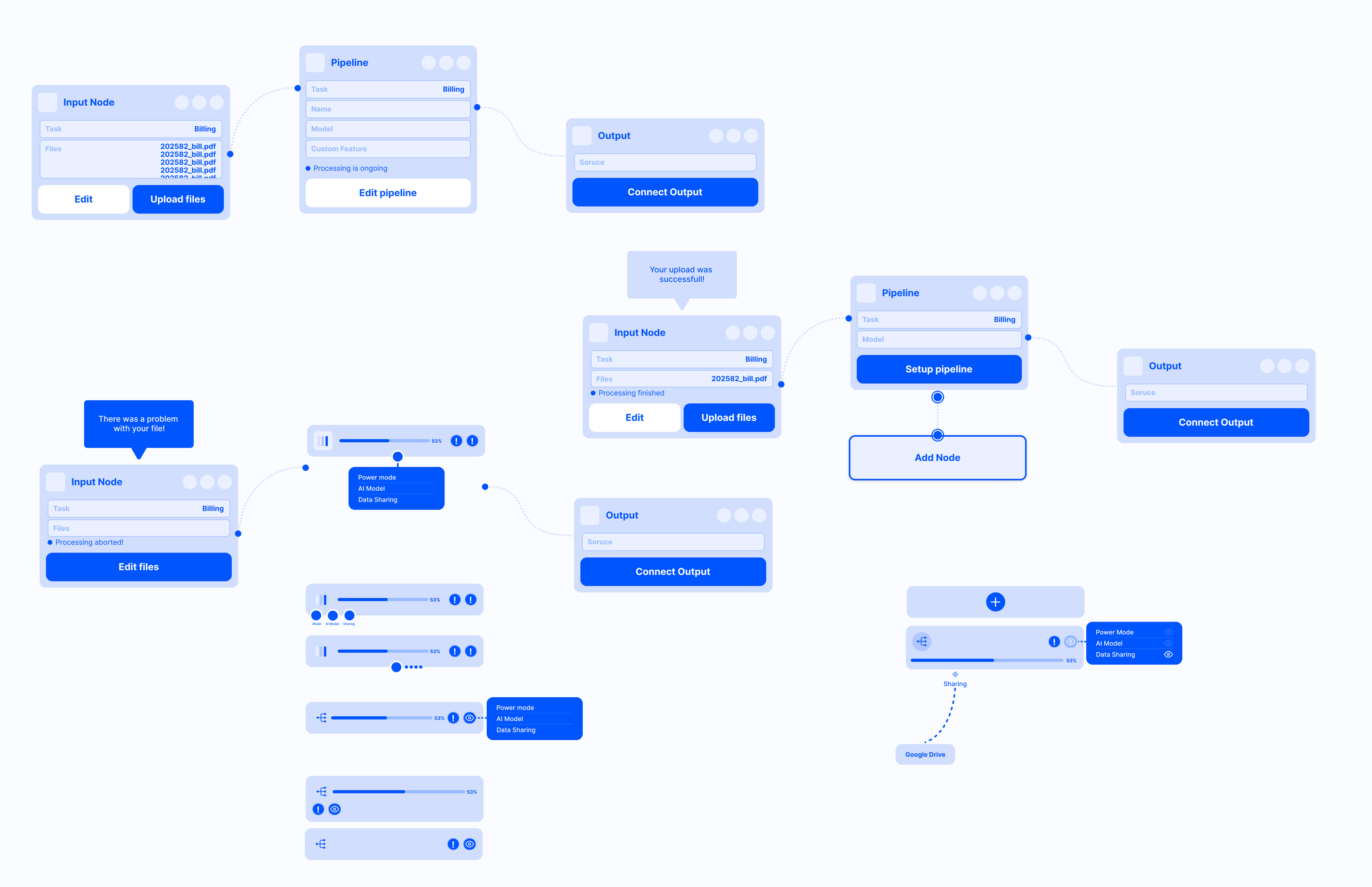
Trials: Different node functionalities - balancing between accessible information and overload
Reflection and next steps
The project was paused before launch, but the groundwork for the image-processing pipeline was complete: a technically informed concept, a mapped system, and wireframes for the core experience.
If the project had continued, the next steps would have been to interview artists and institutions about their admin habits, build personas around their workflows, and test the upload and configuration flows with real users. I'd also have pushed for early decisions on the open scope questions I'd flagged, particularly handwriting support and multi-page uploads, since both significantly affect cost and complexity.